Translating Dense PPTX Decks: Layout, Terminology & Practical Edits
 Equalang
In brief
Dense presentation slides combine tight layouts and niche acronyms. See how professional PPTX translation handles visual structures and terminology across tools.
Keywords: PPTX translation, Professional slide translation, Presentation layout preservation, Technical acronym translation, Slide translation comparison
In international business, research, and technical consulting, presentation decks carry immense information density. Unlike flowing Word documents, presentation slides operate within fixed physical canvas boundaries—much like PDFs. Multi-stage flowcharts, comparison charts, summary cards, and compact footnotes must all fit into tightly defined slide spaces.
When cross-border teams collaborate—such as preparing an English technical briefing for a Chinese project team, clinical site, or local client—translating slide decks usually introduces two major pain points:
- Layout crowding and misaligned shapes: Text expansion can push boxes off-screen or cause awkward line breaks across visual containers;
- Context drift in acronyms and compact phrasing: Space constraints lead to heavy acronym usage and compressed sentences, creating confusing translations if domain context is lost.
Using Equalang to translate PPTX presentations maintains native shapes and text frame hierarchies while translating content. Below, we look at existing translation samples from an authentic, high-density research infographic deck translated from English into Simplified Chinese, exploring how professional slide translation handles layout and context.
Slide 1 Overview: Comparing Original Layout Across Translation Tools
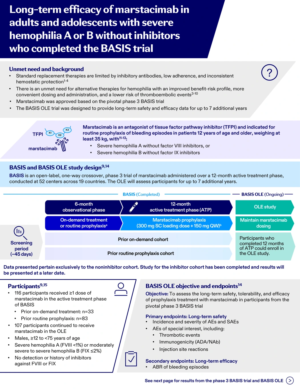
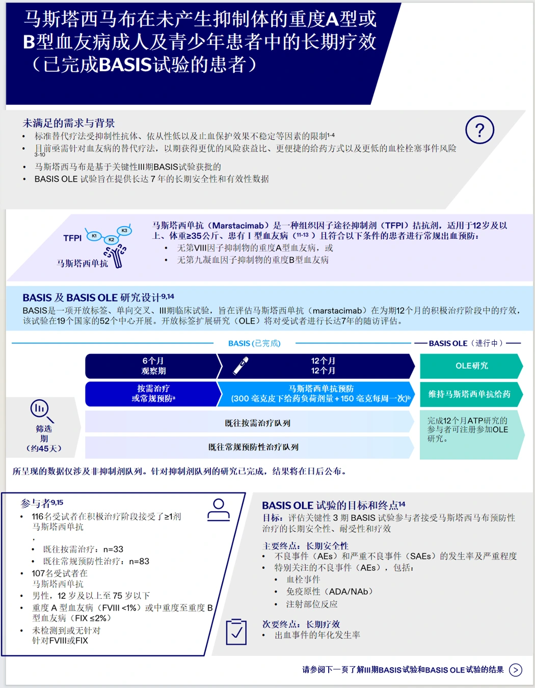
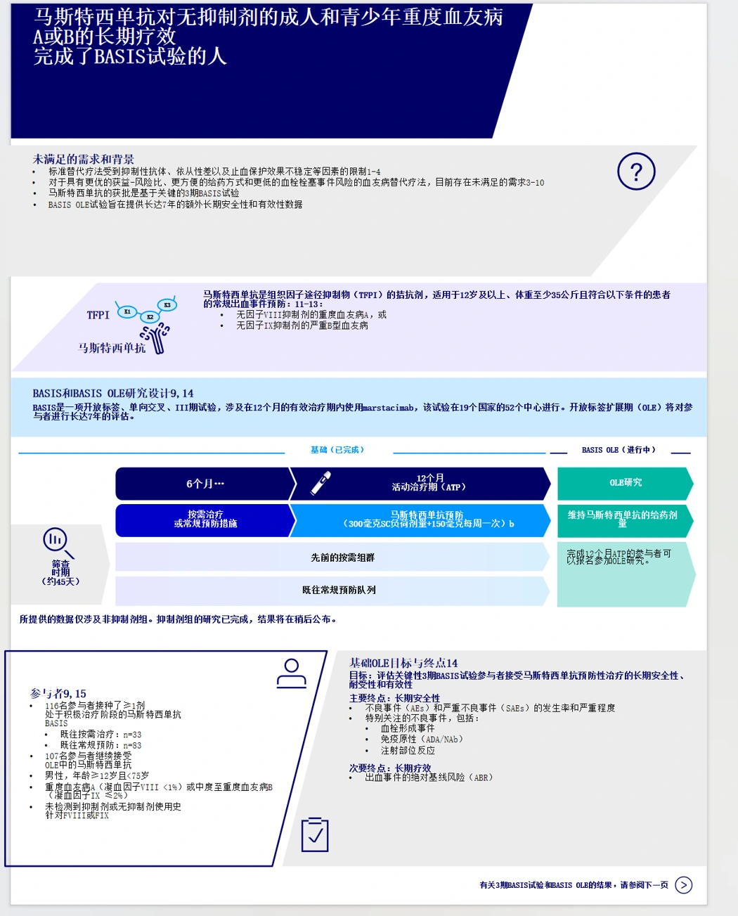
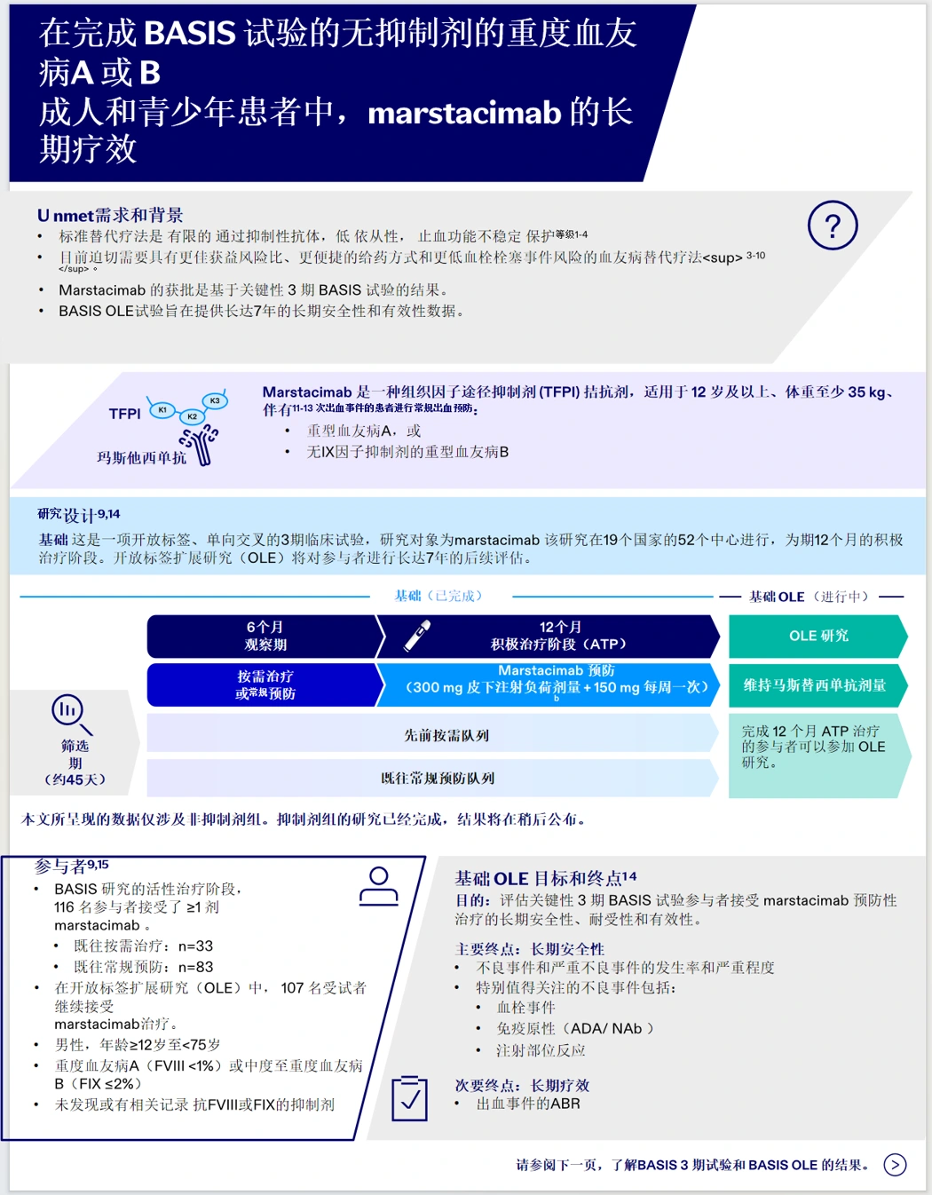
Professional slide decks use colored cards, background containers, and directional arrows to guide the reader. On slide 1 of this sample infographic, content is cleanly organized across three main zones: the top banner holds key takeaways and background rationale, the middle section displays a clinical trial flowchart, and the bottom zone houses participant criteria on the left and trial endpoints on the right.
Here is how the original slide compares across translation outputs:
1. Original Presentation Overview
The original layout is compact and clearly compartmentalized, with tight connections between shapes and text boxes.
2. DeepL Translated Overview
Major background cards, workflow arrows, and two-column layouts are preserved. Text distribution is relatively tight, and trial abbreviations in the endpoints section are handled accurately.
3. Baidu Translated Overview
The overall structural framework and workflow arrows remain seated in place, but font sizes run smaller and more crowded, and key endpoint abbreviations in the bottom-right section show semantic drift.
4. Google Translated Overview
Workflow arrows and two-column blocks remain intact, though title sections exhibit several awkward line breaks, and untranslated English terms (such as "Unmet") remain in the background container.
5. O.Translator Translated Overview
The primary layout is tidy and easy to read, with accurate endpoint terminology. However, text inside the right-hand workflow arrows (such as "OLE study" and dosing notes) remains in English.
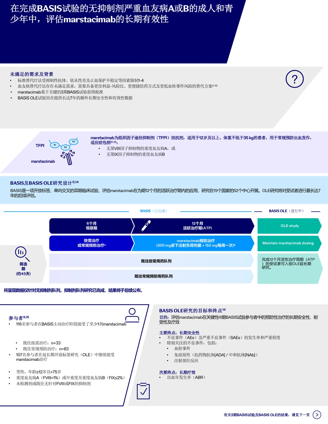
6. Equalang Translated Overview
Main background cards, workflow arrows, and two-column sections remain in their native positions, with Chinese terminology across endpoints clearly rendered. In such a dense layout, however, some localized labels still exhibit text crowding, requiring minor manual adjustments before presentation.
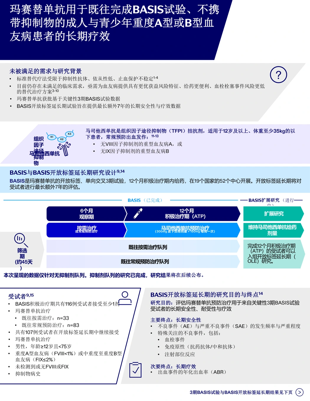
Across all tools, the fundamental presentation structure is recognizable, but each handles text margins, translation completeness, and technical terminology with noticeable differences.
Technical Acronyms: Respecting In-Slide Definitions
Dense presentations rely heavily on abbreviations. Translating them without reference to in-slide glossaries or footnotes often produces misleading terminology.
On slide 1, the secondary trial endpoint lists a core metric: ABR of bleeding episodes.
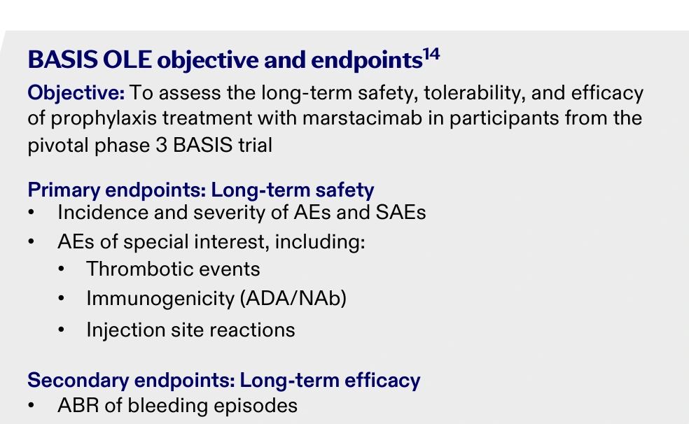
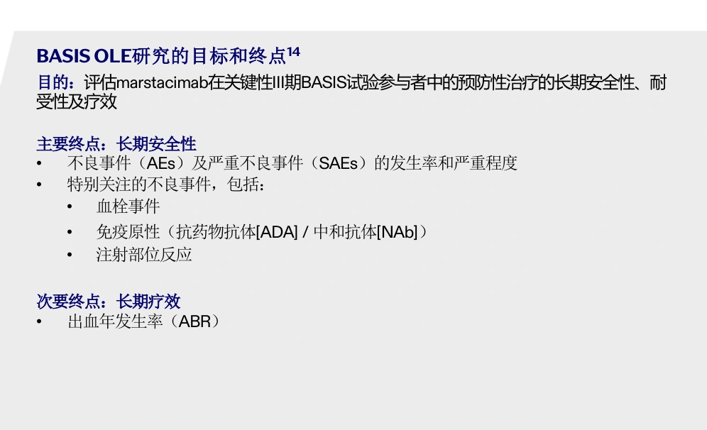
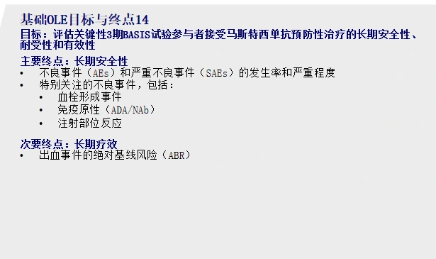
On slide 2, the bottom footnote explicitly defines this acronym: ABR = annualized bleeding rate. Reviewing how different translation tools handled this metric reveals interesting differences:
- DeepL sample: Rendered as "出血事件的年化发生率" (Annualized incidence rate of bleeding episodes), accurately capturing the intended clinical meaning with neat alignment.
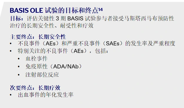
- O.Translator sample: Translated as "出血年发生率(ABR)" (Annual incidence rate of bleeding [ABR]), reading naturally and preserving clean visual spacing.
- Baidu sample: In this section, ABR was translated as "出血事件的绝对基线风险(ABR)" (Absolute baseline risk of bleeding episodes), diverging from the annualized rate defined in the presentation.
- Equalang translated output: Grounded in the clinical context, it translates the endpoint into "出血事件的年化出血率(ABR)" (Annualized bleeding rate of bleeding episodes), preserving the native text box for easy editing.
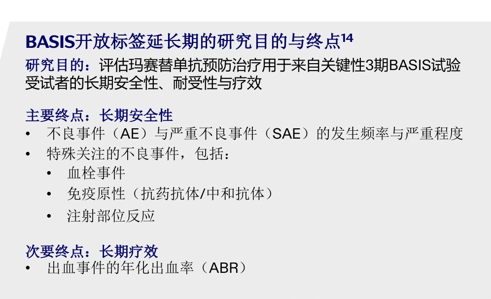
DeepL, O.Translator, and Equalang all translate this metric accurately. In technical workflows, checking abbreviations against slide legends remains a best practice.
Tool Comparison & Selection Guide
Based on this sample of dense research infographics, we evaluate each tool across three practical dimensions—container and layout stability, domain acronym precision, and in-shape text completeness—to help readers choose the right workflow:
* Note: Google Translate was not evaluated via an isolated ABR crop; its rating reflects visible slide-wide layout and textual completeness without penalizing unexamined items.
In practice, each tool presents distinct trade-offs: if terminological accuracy is the primary consideration and a tighter layout is acceptable, DeepL delivers a solid rendering in this sample; O.Translator suits readers who prioritize visual breathing room and are comfortable translating workflow arrows manually; for workflows that prioritize clinical terminology fidelity and direct downstream editing in PowerPoint, Equalang offers a practical, editable baseline.
Importantly, all tools evaluated here export native .pptx decks with editable shapes and text frames rather than flattened image bitmaps. When working with compact presentation decks like this sample, readers can weigh layout spacing against terminology preferences; after downloading the .pptx file, any localized text overlapping or line breaks can be adjusted directly in Microsoft PowerPoint.
How to Translate a Professional PPTX Deck
Translating a presentation deck takes four direct steps:
- Visit the Equalang Documents Translation workspace and sign in;
- Upload your
.pptxpresentation deck; - Choose your target language (such as Simplified Chinese) and submit the task;
- Once processing finishes, download the translated
.pptxfile and open it in Microsoft PowerPoint for review and customization.
For best results, review the translated presentation alongside the original slides. Use the translated layout to quickly absorb complex concepts and verify key numerical units. Because the downloaded .pptx retains native text boxes, you can directly click into PowerPoint to fine-tune any localized crowding or line breaks before sharing the deck with colleagues or clients.